Transforming Africa’s Amazon
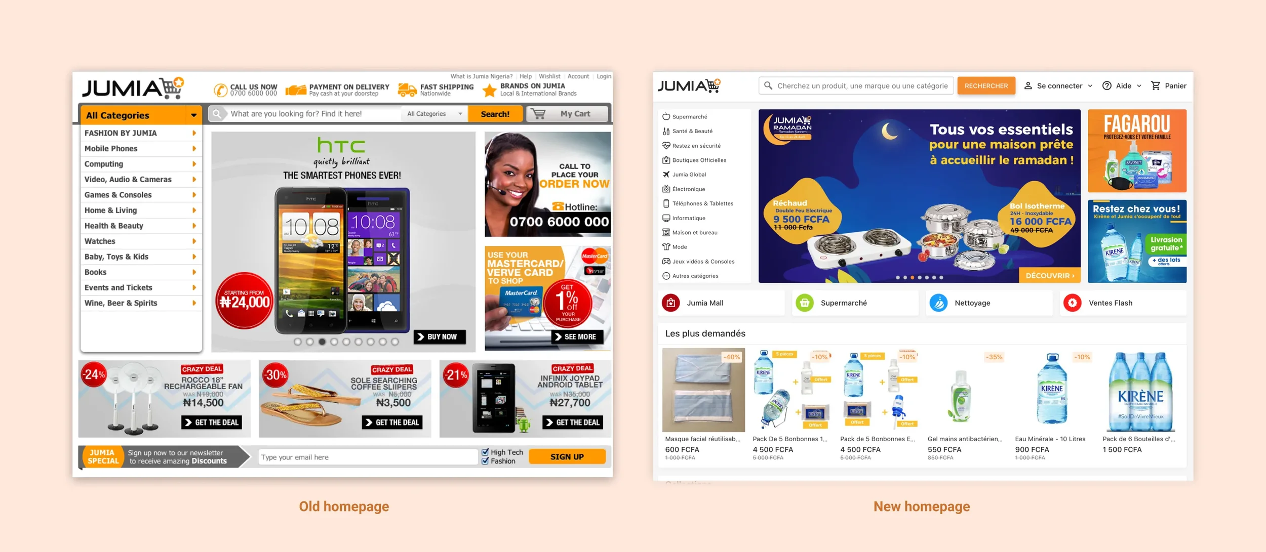
Jumia, sometimes called the “Amazon of Africa”, is the biggest online shop in the continent. However, when I joined the company, it was facing a challenge: how to deliver a consistent e-commerce experience despite varied African marketplaces? Through a complete redesign we streamlined the experience, resulting in a simpler platform where millions of customers can browse products and pay with confidence, regardless of what device they use or how reliable their internet access is.

COMPANY / YEAR
Jumia 2018-2020
INDUSTRY
E-commerce
TIMELINE
24 months
CHALLENGE
Shopping on Jumia felt fragmented and slow, conversion rates lagged, mobile experiences were inconsistent, and the checkout process frustrated users. The main issues were:
Brand perception was weakened by inconsistent design.
Mobile experiences felt broken.
The checkout process created friction.
Users struggled with slow connections, and a lack of trust in online payments.
The interface was slow and heavy.
Jumia needed a unified, mobile-first platform that simplified shopping and built trust for its users.
RESULT
We modernized Jumia's platform with a complete redesign, creating:
A mobile-first Progressive Web App (faster load/ reliable across devices).
Improved navigation and checkout flows.
A modular design system adaptable to regional campaigns.
Clear hierarchy and transparent payment processes.
This contributed to significant impact metrics:
Annual Active Consumers: grew from 2.7M (2017) to 6.8M (2020).
Gross Merchandise Volume: rose from €507.1M (2017) to €836.5M (2020).
Total Revenue: grew from €94M (2017) to €139.6M (2020)
Process
UNCOVERING THE PAIN POINTS
Diverse infrastructures and cultural behaviors shape Jumia’s complex ecosystem. Many customers shopped on low-end devices with limited performance, often relying on cash-on-delivery due to mistrust of digital payments.
The key pain points:
Slow internet connections.
Long checkout processes causing frustration and drop-offs.
Cluttered product listings slowing decisions.
Navigation confusion across inconsistent interfaces.
Low trust due to lack of social proof and hidden costs.
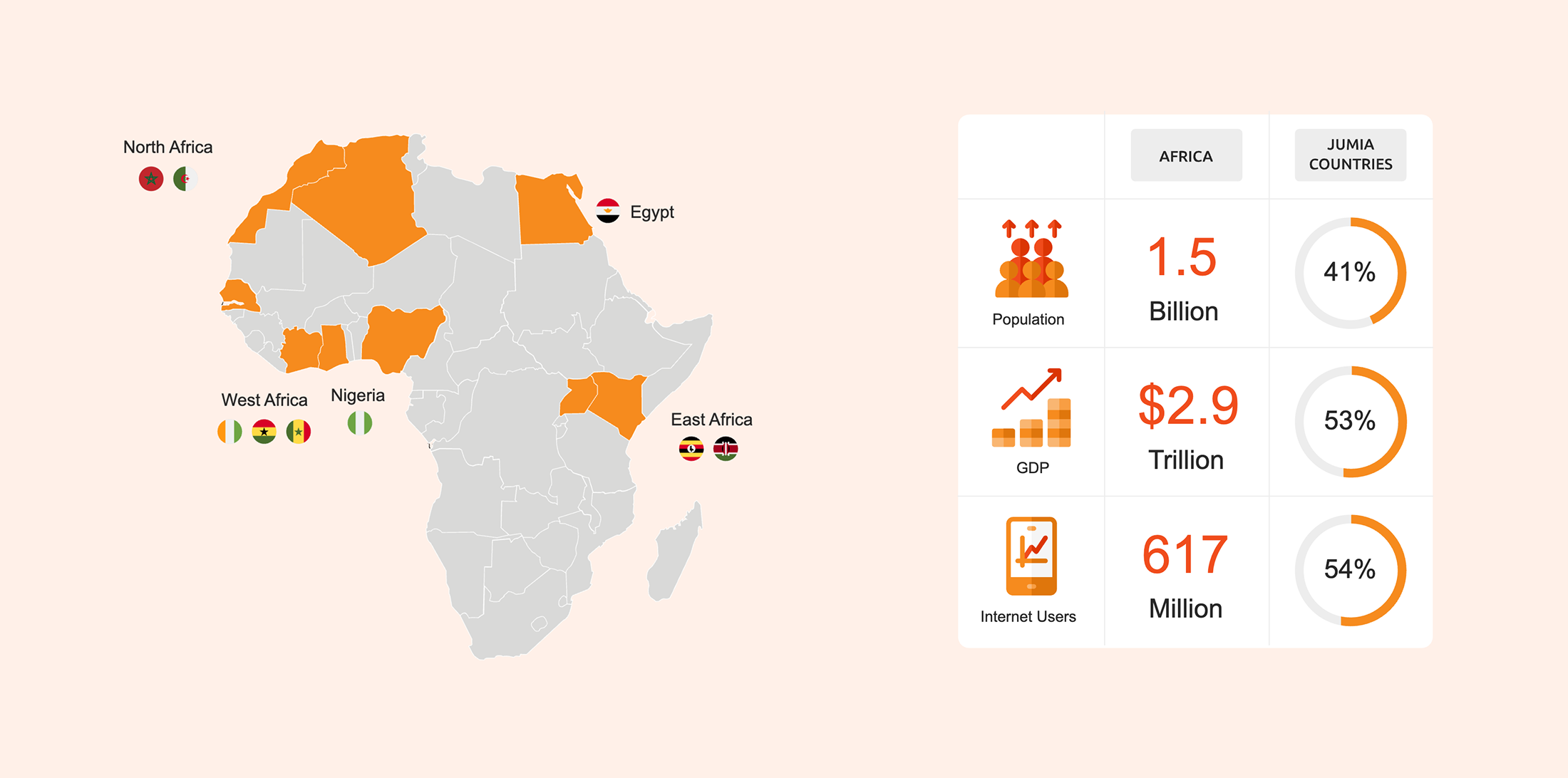
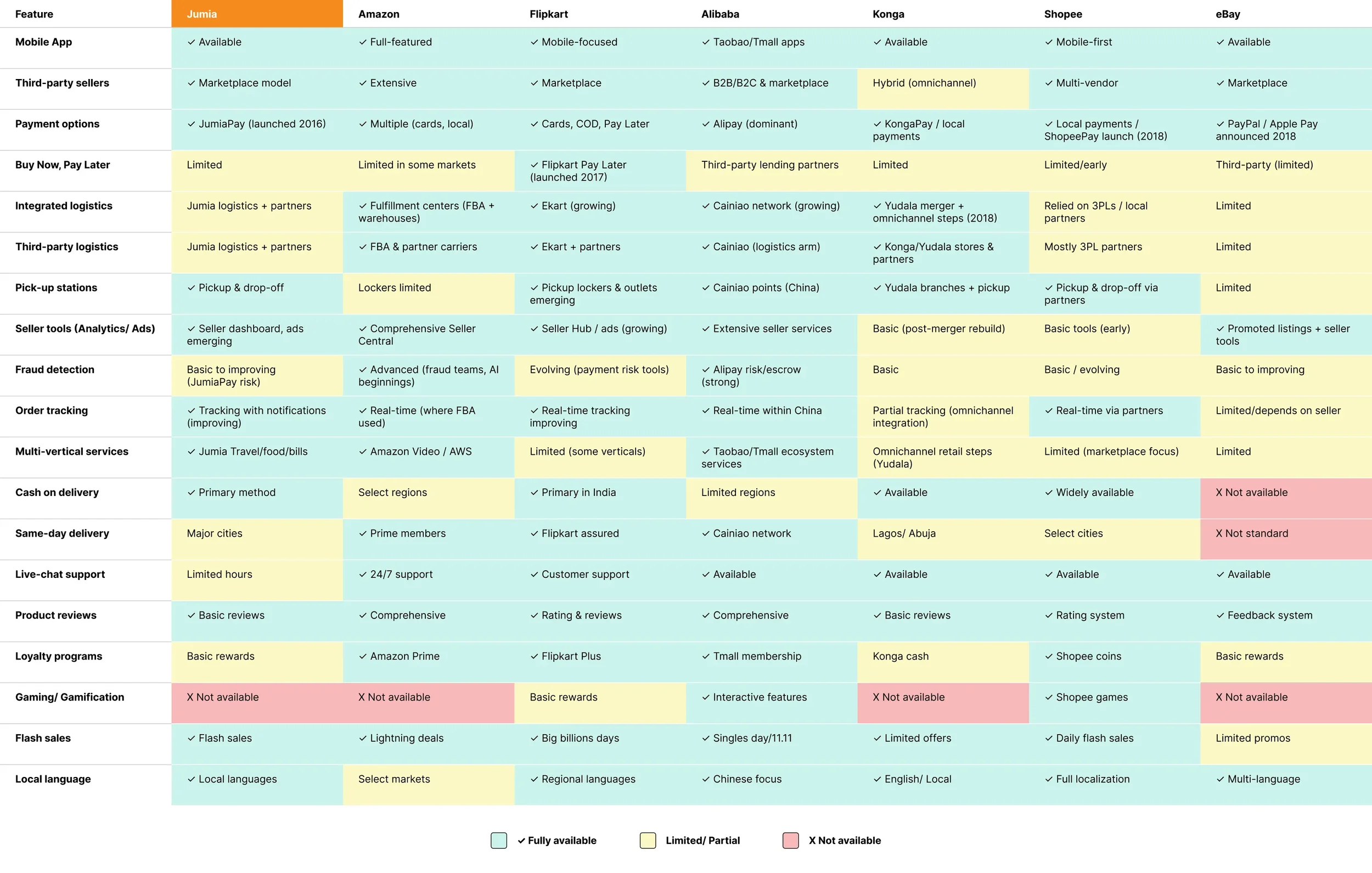
COMPETITIVE LANDSCAPE REVIEW
I collaborated with the Product team on a deep dive analysis into Jumia’s competitors, regional and global leaders like Amazon, Shopee, and Konga.
We:
Looked at user experience patterns and conversion strategies.
Analyzed checkout flows, how search and product discovery was implemented.
Gathered examples in a screenshot library of best practices.
Looked at user reviews and app store ratings to spot where the apps felt unreliable or hard to use.
Three ideas guided our design principles: the user flows should be straightforward, fast, and also reliable.
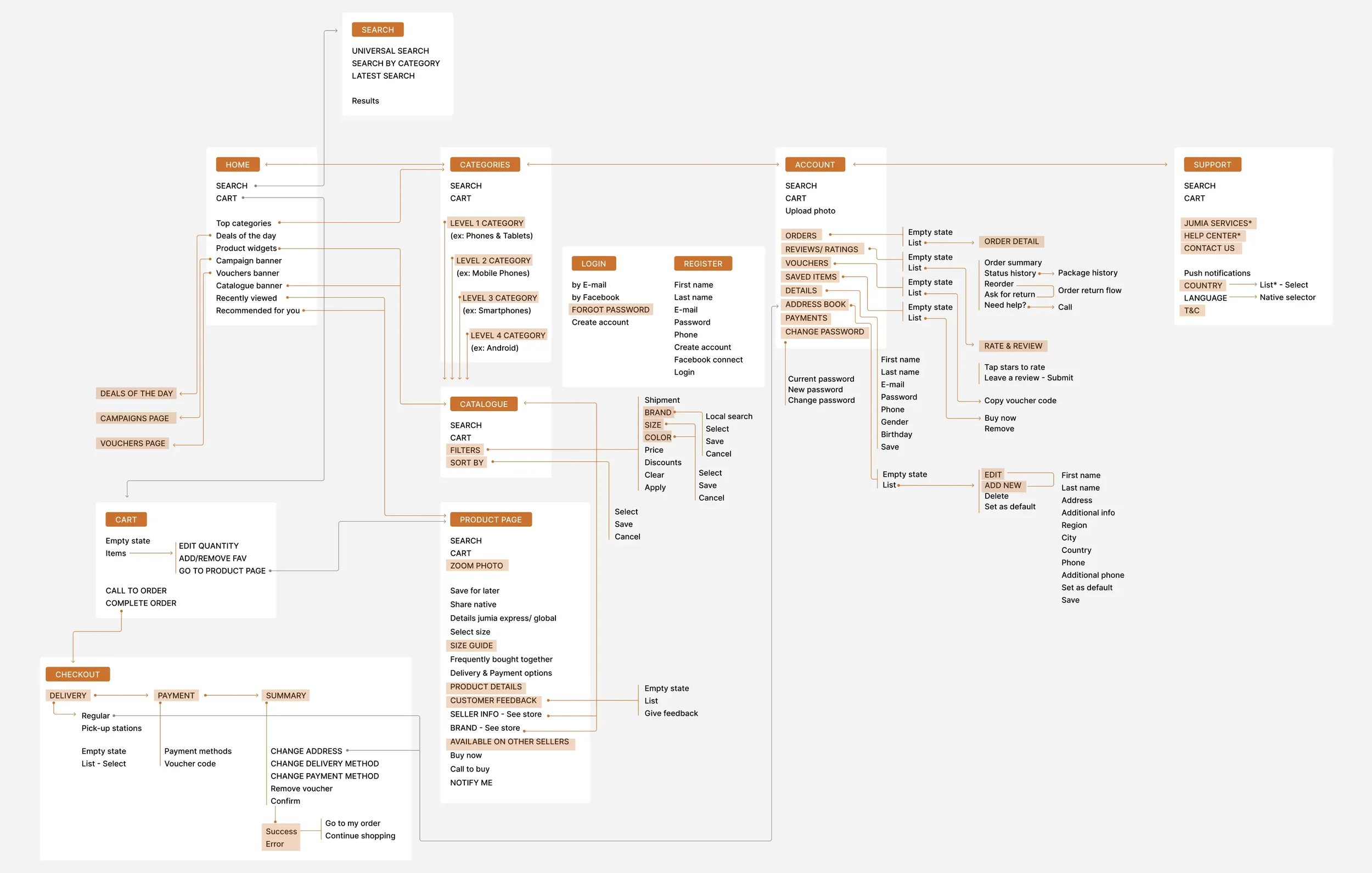
INFORMATION ARCHITECTURE
We introduced a Progressive Web App (PWA) with a mobile-first interface, to make load times faster and the experience more intuitive. It presented the best outcomes when considering some of Africa’s connectivity realities.
The key initiatives were :
Dynamic homepage prioritizing local content and campaigns.
Modular layout supporting regional customization.
Progressive image loading for low-bandwidth environments.
Progress indicators in the checkout flow, with transparent pricing, and local payment options.
Decision-driven product pages with clear hierarchy and trust signals.
With these guiding principles, we then deep dived into the user flows, reduced friction points and created a site map with all features and connections.
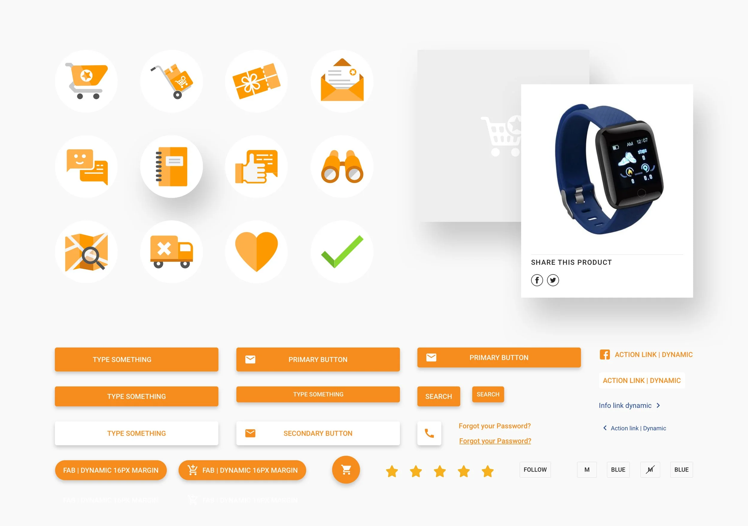
DESIGN SYSTEM
Jumia’s design system was build for scale and localization. We balanced global e-commerce best practices with African cultural sensibilities. I worked closely with the frontend team, to design a system that could scale across markets, and balance modern aesthetics with cultural relevance.
Every component was designed with African infrastructure realities in mind:
Buttons: Larger tap targets for less precise touchscreens.
Images: Smart compression and progressive loading for slower connections.
Forms: Streamlined inputs with minimal required fields.
Cards: Simplified product cards with clear hierarchy, fewer distractions, and support for multilingual content.
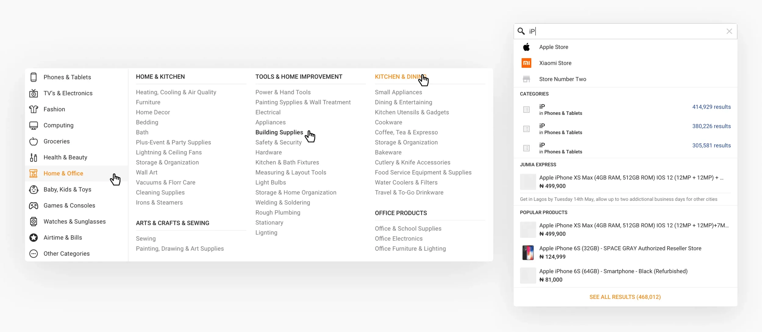
Navigation: Lightweight menus with collapsible categories for faster load times and easier discovery.
Search & Filters: Optimized search bar with typo tolerance and quick, mobile-friendly filter chips.
DESIGN HIGHLIGHTS

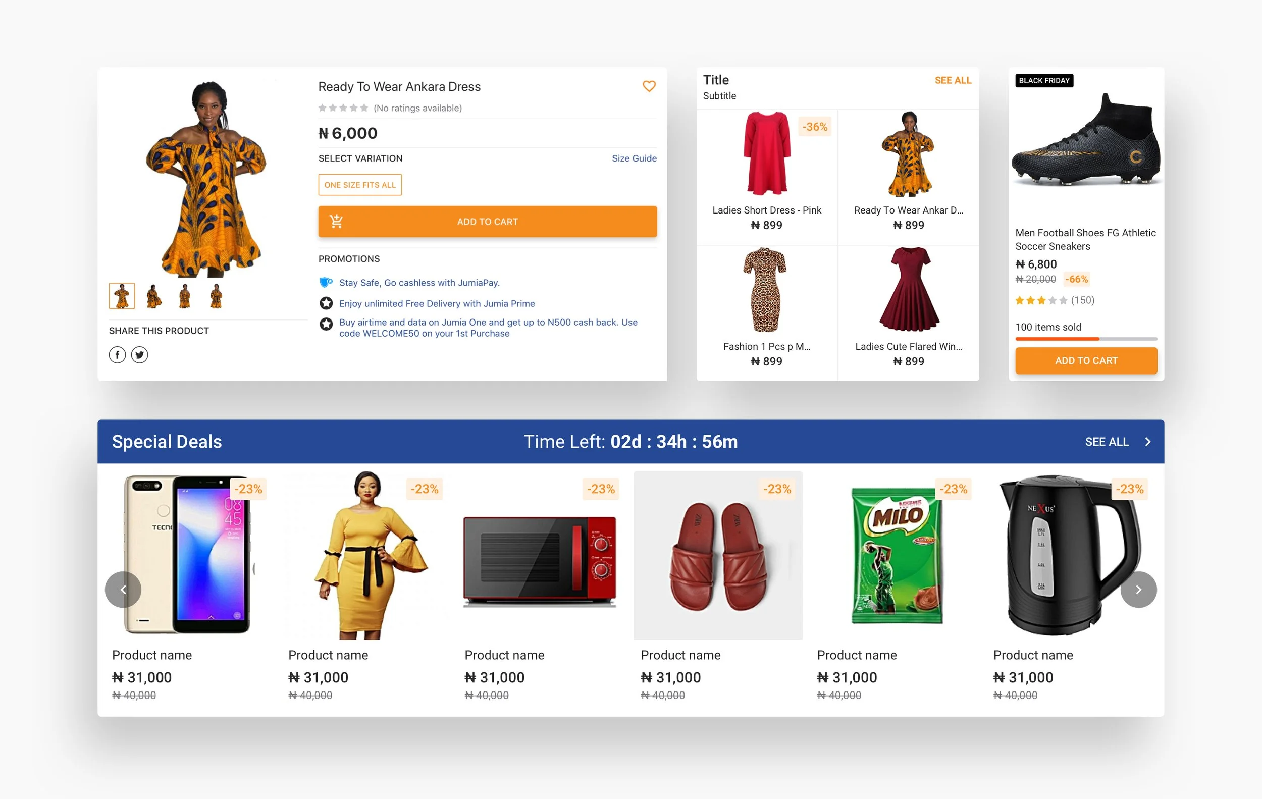
Homepage
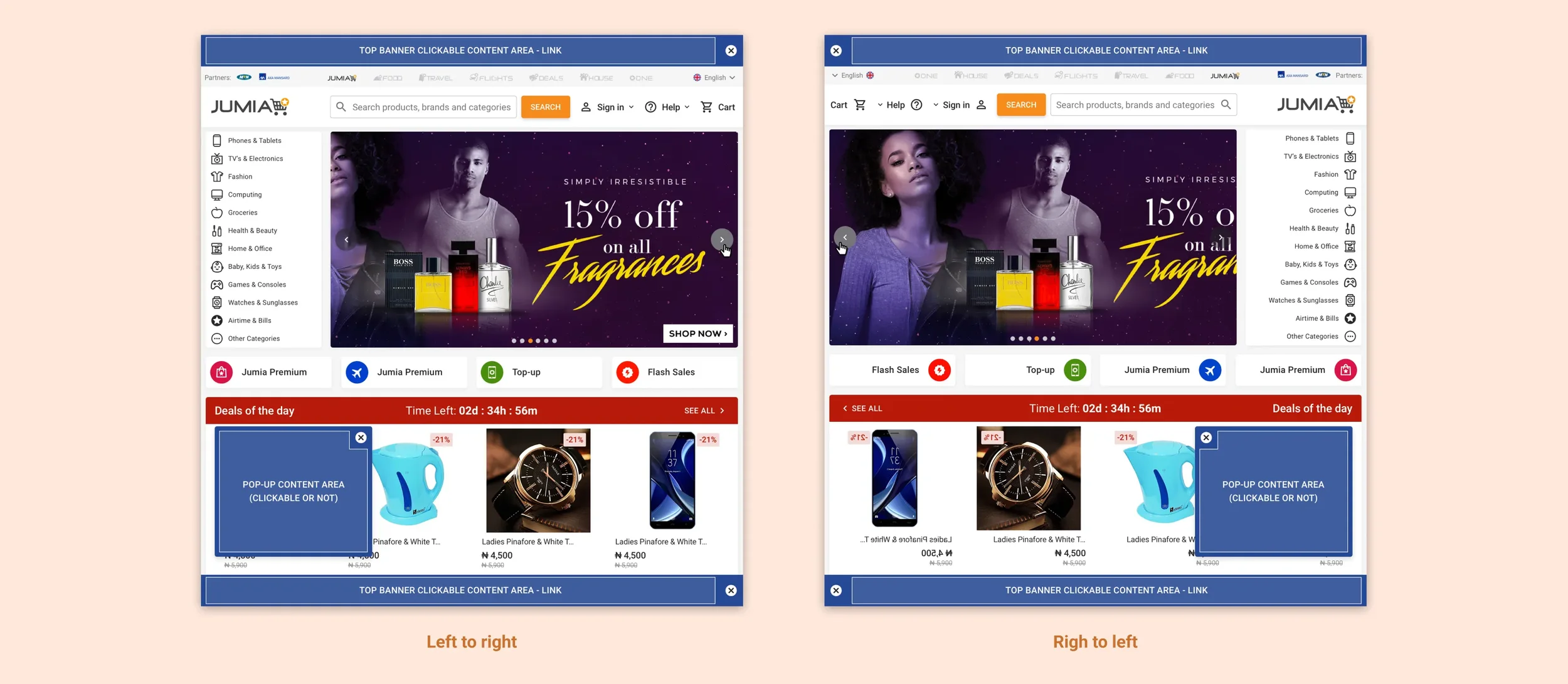
The homepage was one of our biggest challenges, because we wanted to prioritize content based on location, but keep a consistent brand experience across all countries. As each market had different top-selling categories, we developed a dynamic system with a modular approach:
Hero banners that could showcase local campaigns.
Customizable card blocks and backgrounds.
Category navigation fully adaptable to regional preferences.
Cultural elements like testimonials in local languages and influencer partnerships.

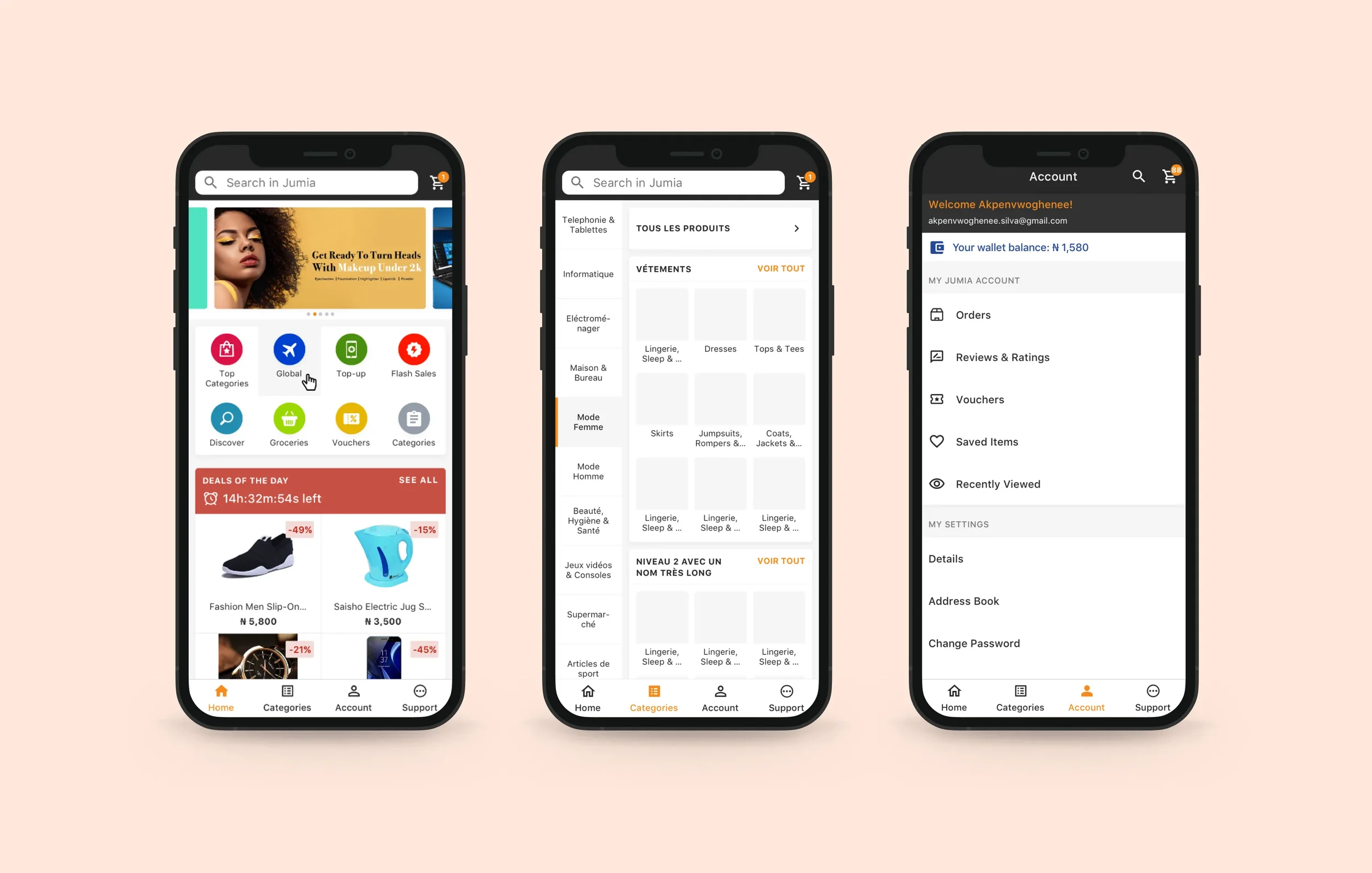
Mobile-First
By 2018, our data showed that most of the traffic came from mobile devices, often older Android phones on 2G or 3G connections. This reality shaped every wireframe decision.
We redesigned the product catalog with thumb-friendly navigation and implemented progressive image loading. The mobile wireframes prioritized speed and data efficiency over visual flourishes.
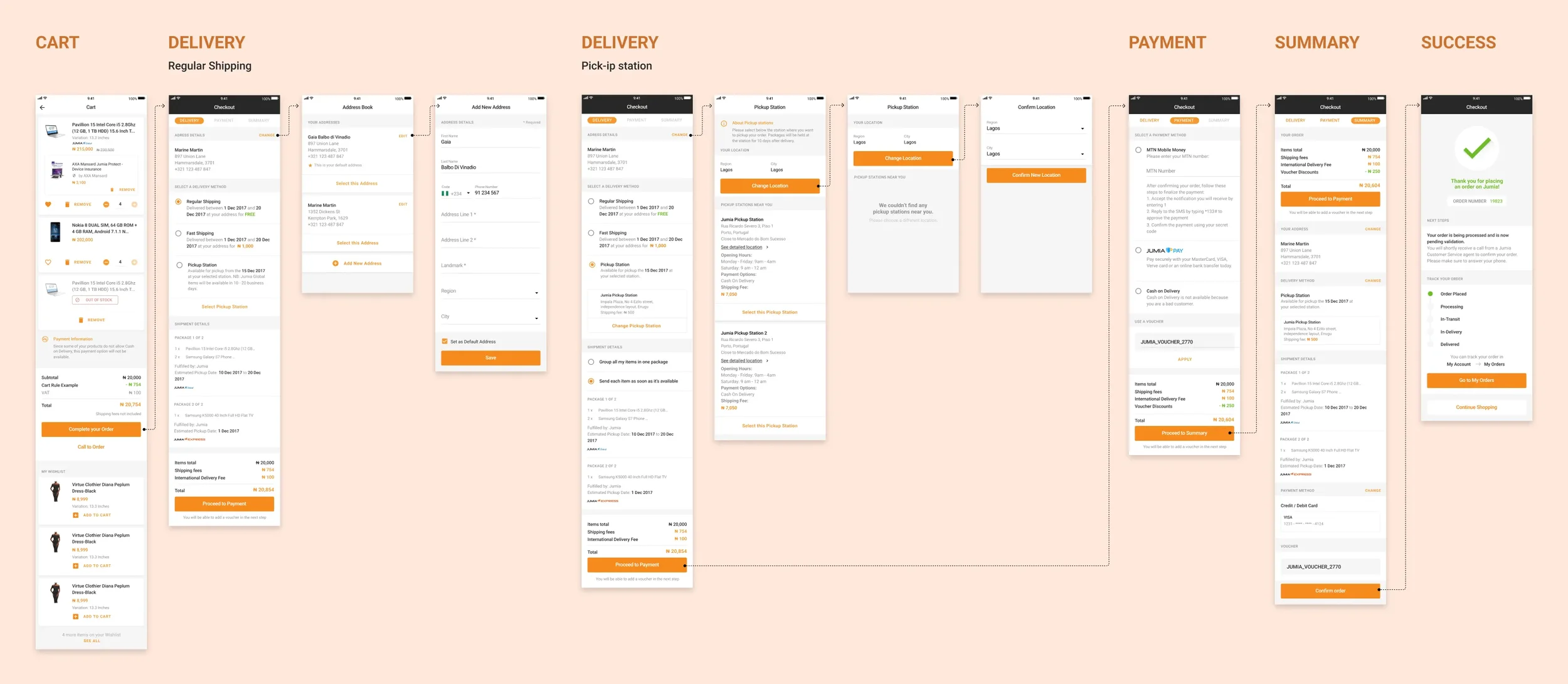
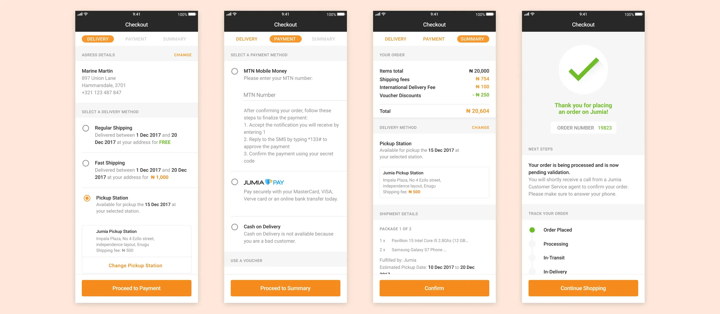
Simplifying Checkout
The checkout flow was simplified to reduce friction and build trust. We added progress indicators to reassure the users and provide feedback. We introduced clearer cost breakdowns, visually hierarchising the elements in the page to replace the long, confusing process that often led to cart abandonment. Our mobile-first approach ensured smooth performance on slower networks and older devices, while flexible payment options like mobile money and cash-on-delivery were made more visible. These changes made checkout faster, finishing purchases became quicker, clearer, additionally trustworthy, improving both conversion and user confidence.
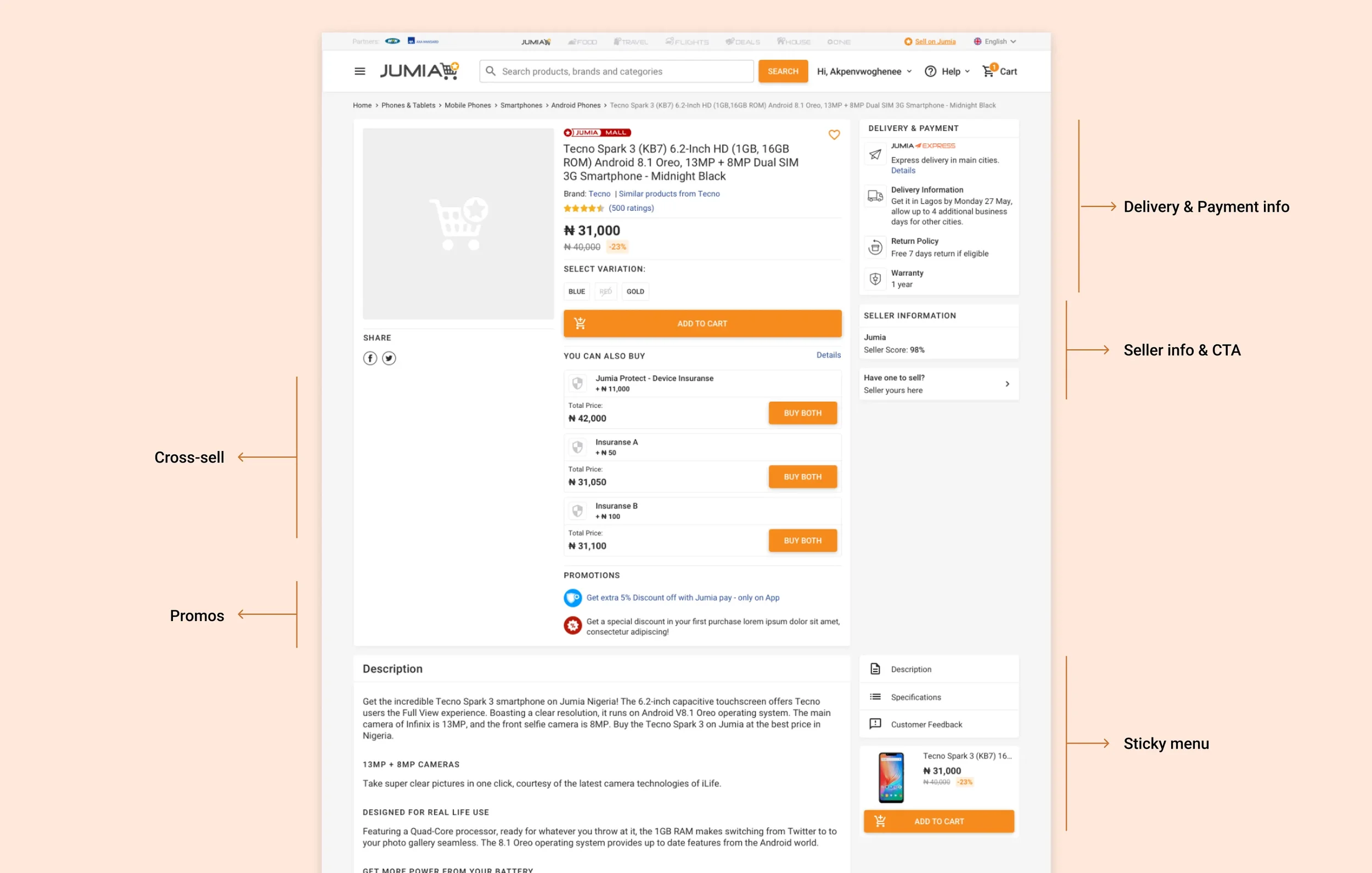
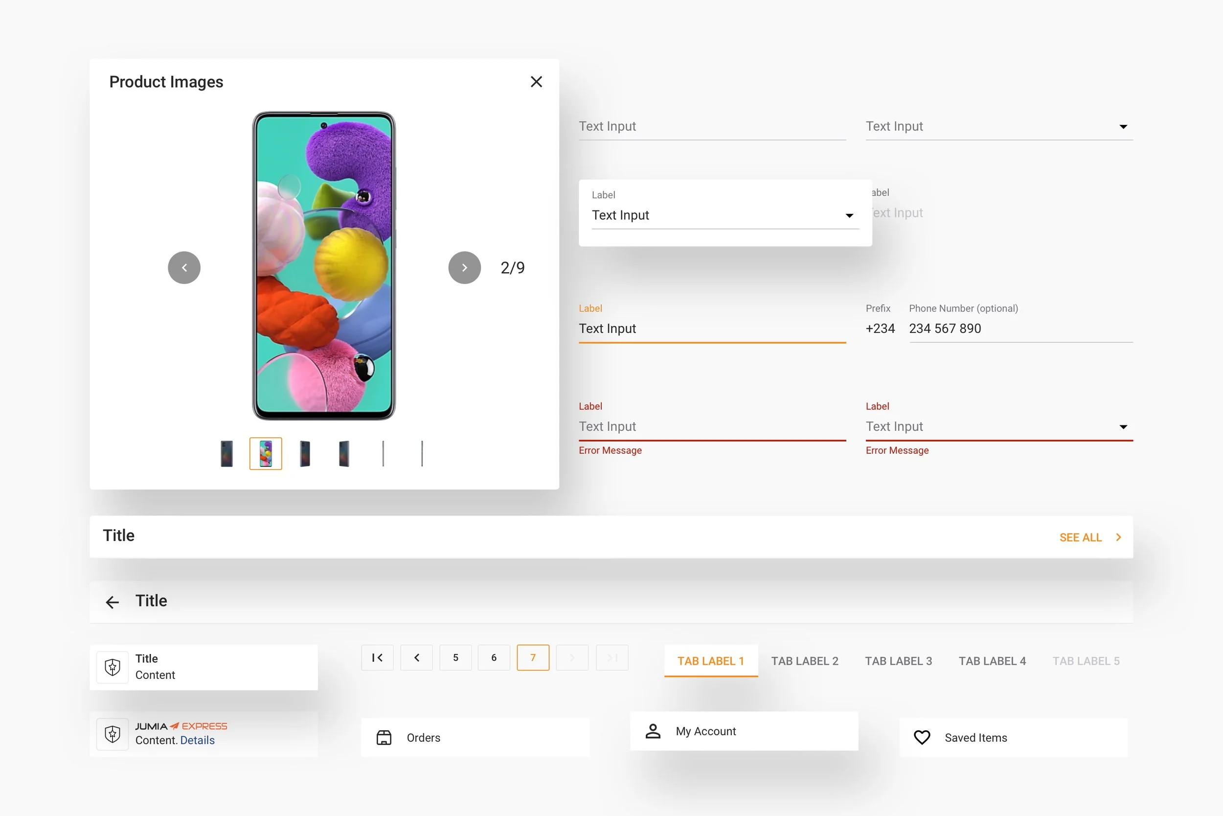
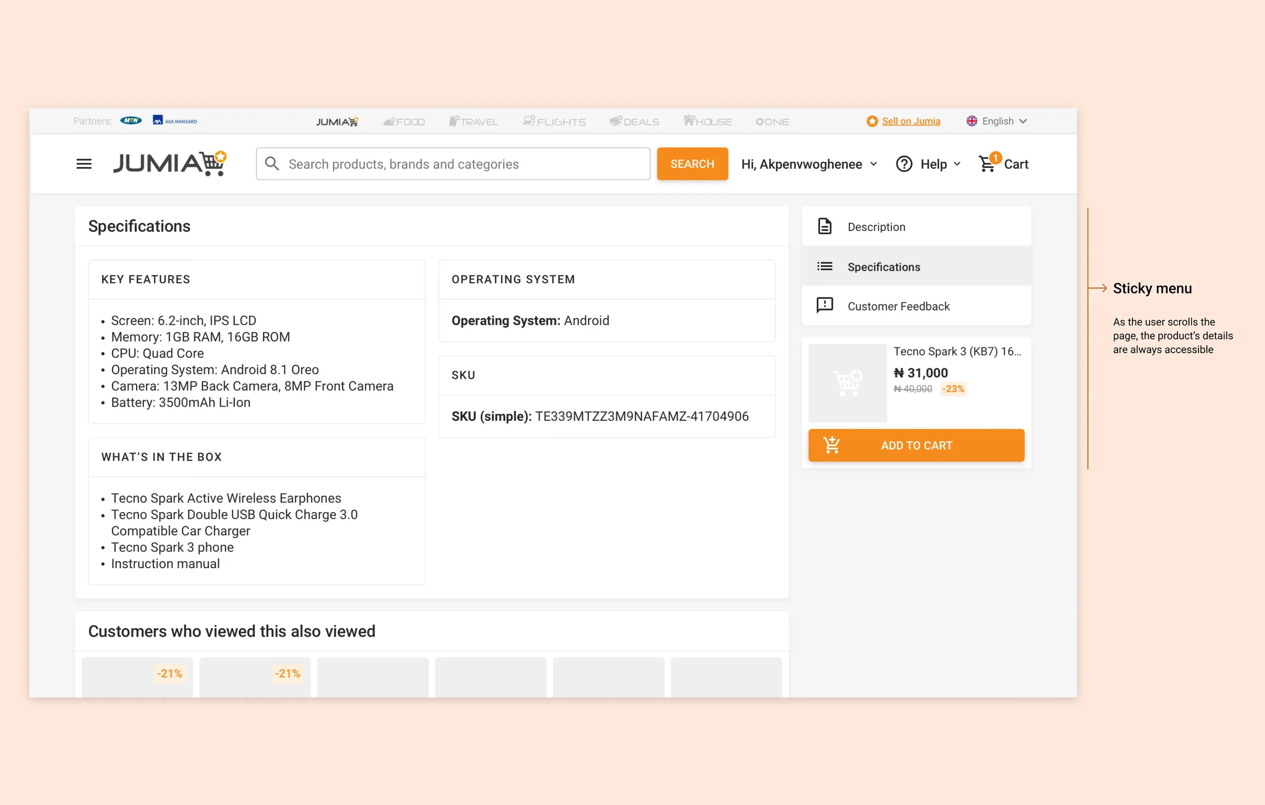
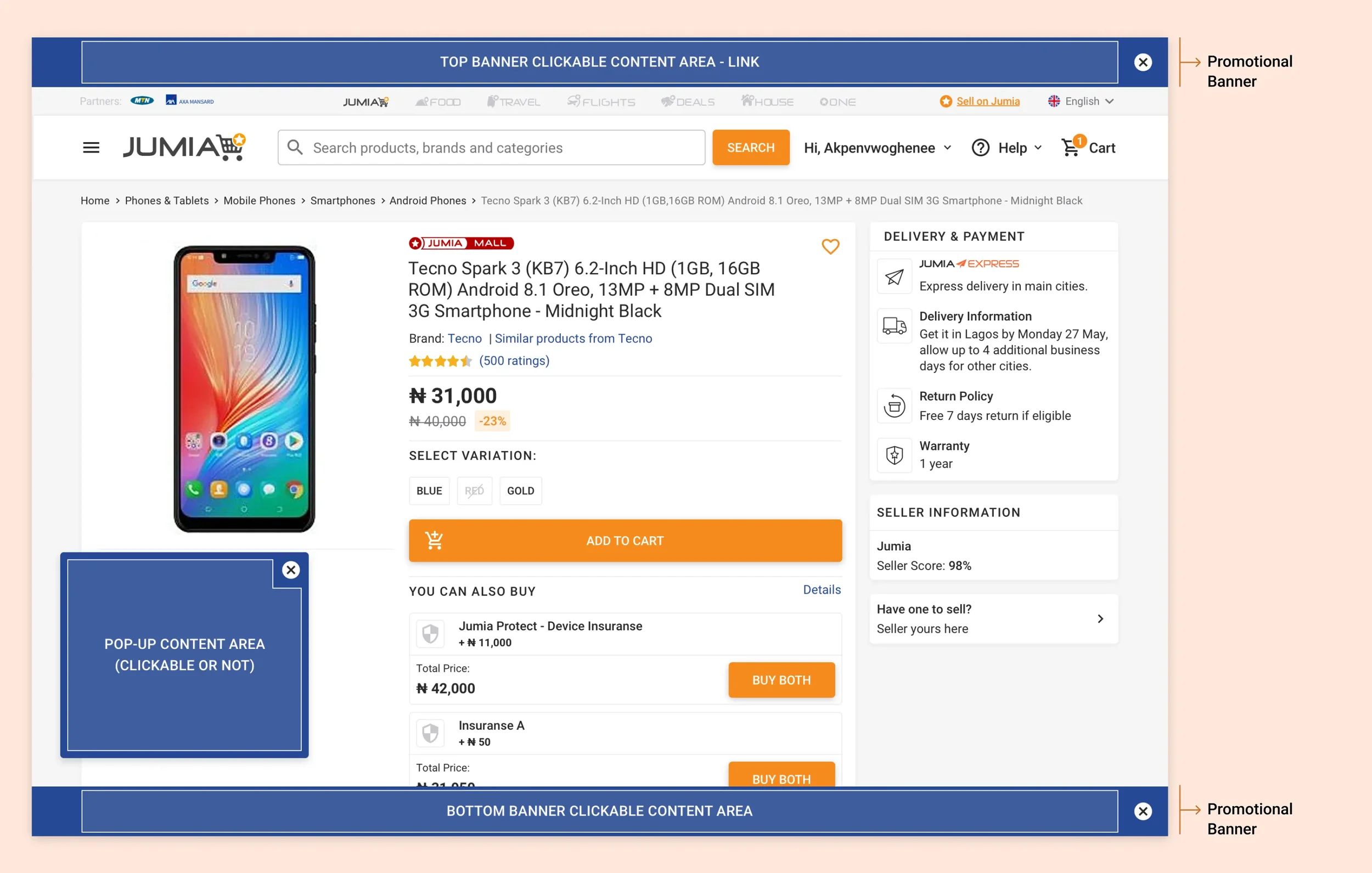
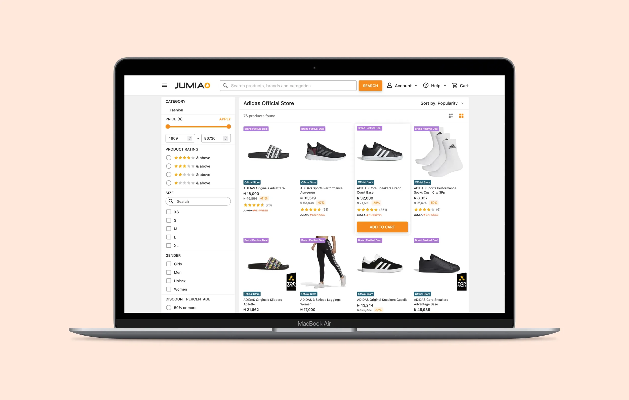
Decision-driven Product page
We revamped the product page, to highlight the essential details: images, price, features, shipping, reviews, and vendor details, while cutting down unnecessary clutter. A clear hierarchy, with anchor links to overcome the often long pages, helped users navigate quickly in the page to find the content they were looking for. Faster image display meant easier viewing plus quicker load times on any device. The product page became more adaptable for local markets, allowing each local team add their own offers while still keeping brand consistency. By emphasizing trust signals and usability, the new product page offered a cleaner, more engaging shopping experience. It built confidence in customers with a simpler, better way to shop.
Outcome
Jumia’s design needed to feel premium enough to compete globally, while welcoming newcomers. We worked our way to develop a clear, light interface with enough visual cues to guide our users without overwhelming them.
The interface worked seamlessly across all devices, navigation and interactions were optimized for one-handed use, with fast-loading images and swipe-friendly product galleries. Desktop designs leveraged larger screens with multi-column layouts, detailed product views, and advanced interaction features. No matter the device or connectivity quality, the experience felt engaging and consistent.
06. Reflections
Switching to a PWA was transformative. When our users moved from heavy browser pages to a lighter PWA, it reduced friction, data cost, and load times. This helped improve engagement and conversion and made everything smoother.
This project is one of my most meaningful design challenges: we balanced global practices with local needs, technical constraints with user expectations, and business needs with ethical design practices. What I learned still guides the way how I approach design challenges today.
View other projects
KNOK
Designing the future of care
7EGEND